THE ASK
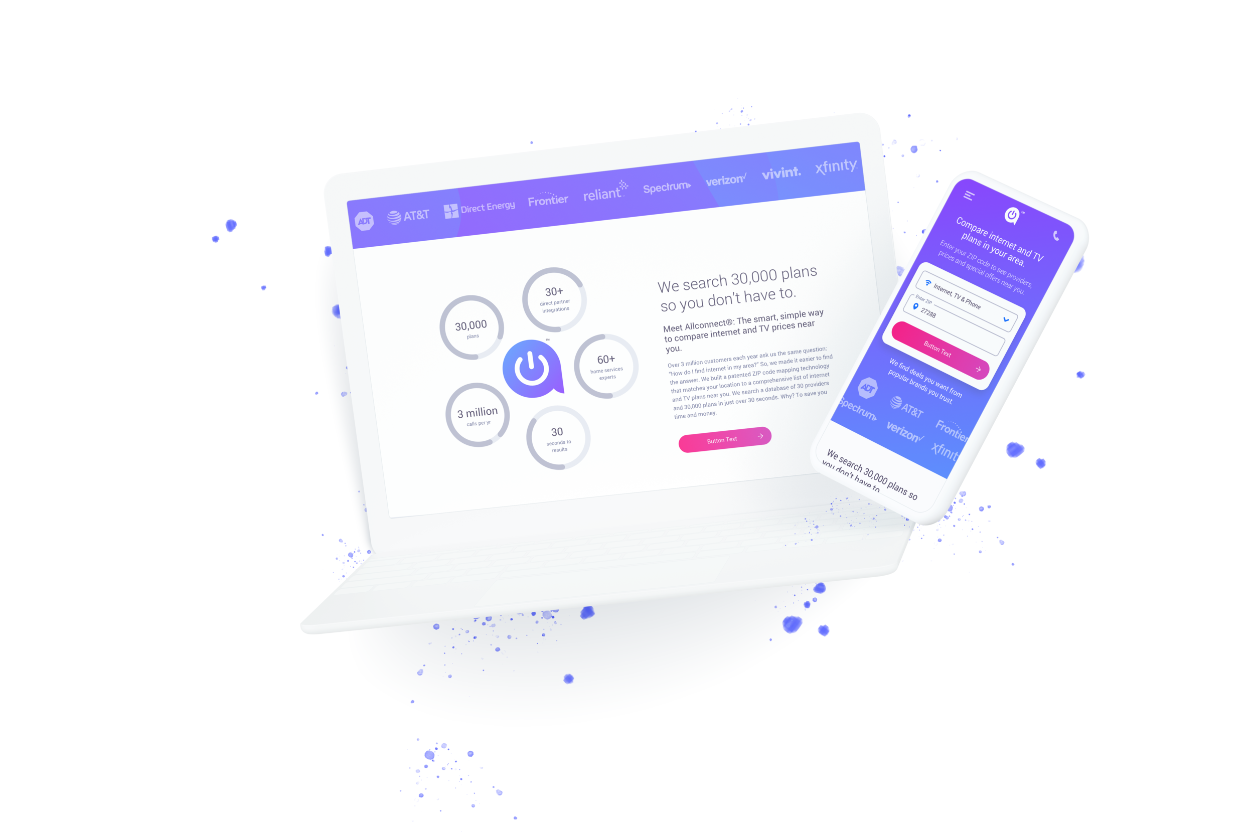
As a leader in the home service marketplace, Allconnect needed a more intimate connection to the user base. We were tasked with creating a fresh UX strategy and visual language make over for an SEO powered site that had to be built on a CMS platform.
Our high level goals were to:
Allow the connection of all home services in one place
Provide rich and accurate product information with seamless API integration
Simplify peoples lives by making purchasing decisions as transparent as possible
Introduce a scaleable cart flow that can span across different partners
Project Roll:
UI design
Interaction Design
Site strategy
Design system creation
DISCOVERING AN AUDIENCE
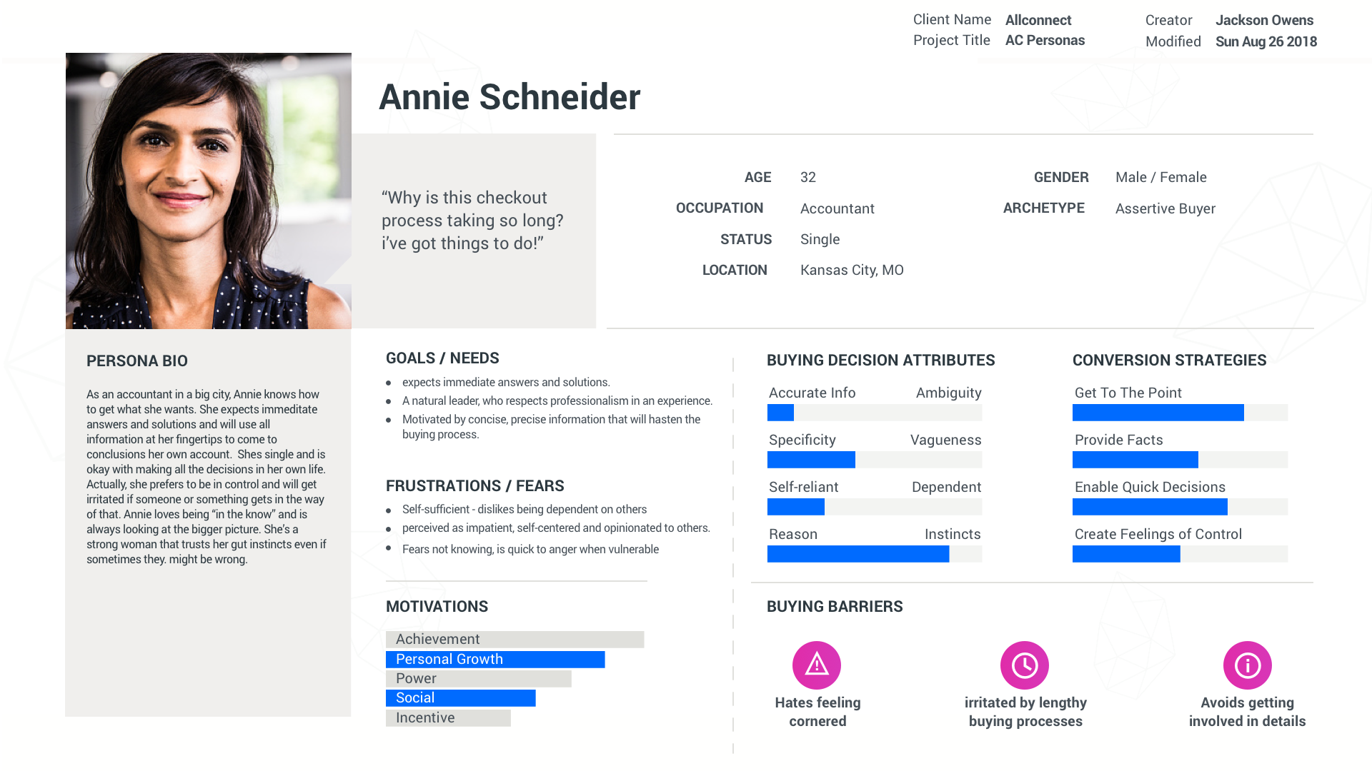
We conducted group think activities as well as analyzed some of the current user data we had on the old Allconnect site to establish the types of people that buy plans through our site. Our lead UX designer came to us for very dense behavioral analysis documents and I turned them into tangible personas for our team to reference throughout the build.
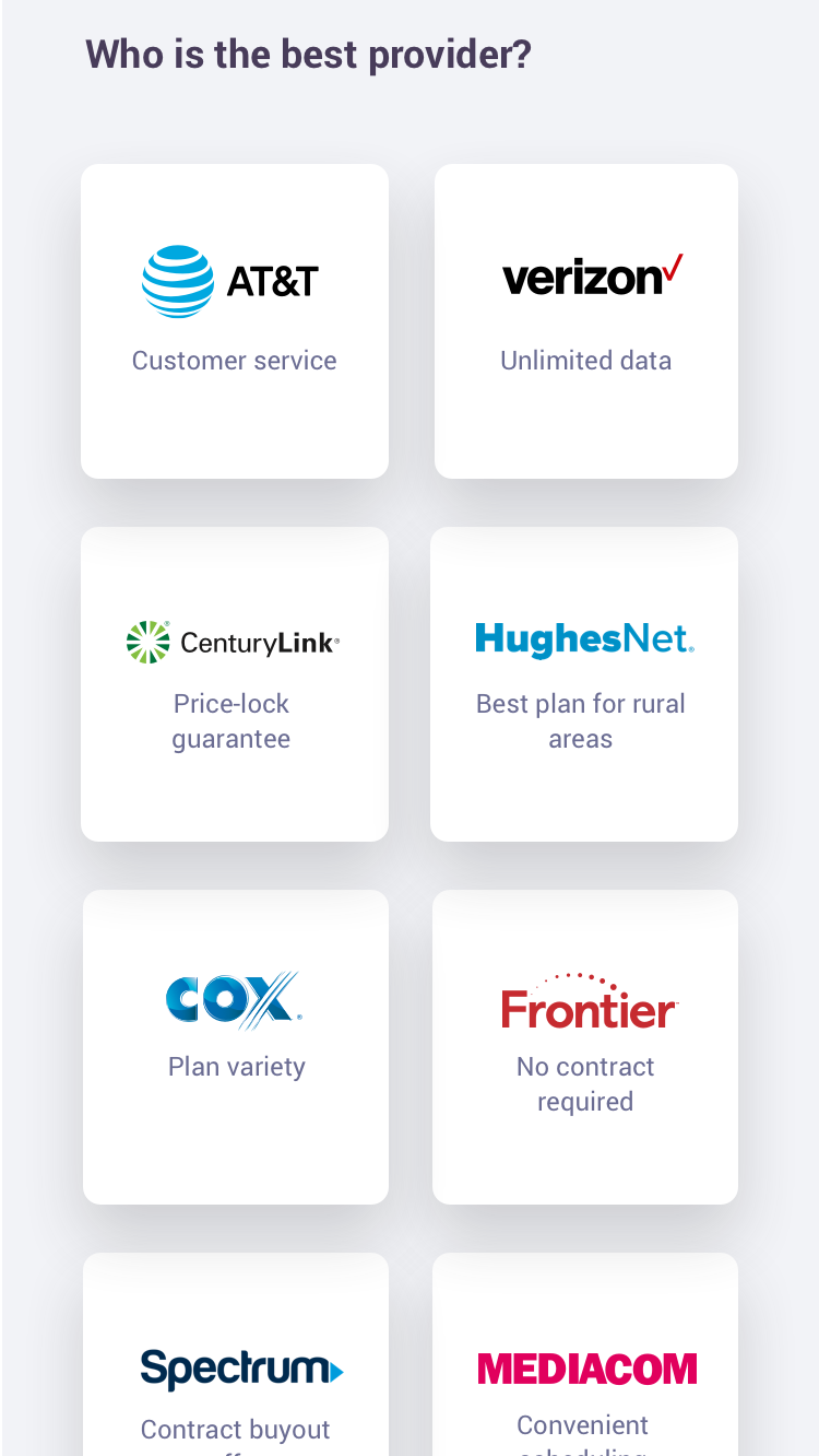
We broke the personas into 3 different Archetypes: Assertive Buyer, Expressive Buyer, and Cooperative Buyer. Each of these archetypes were broken into different demographic groups but i've provided a small sample of them here.
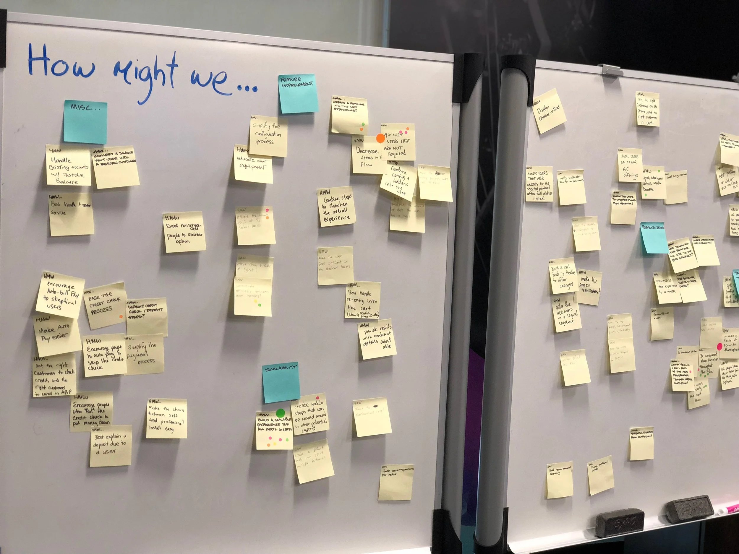
DESIGN PRINCIPLES THROUGH SKETCHING
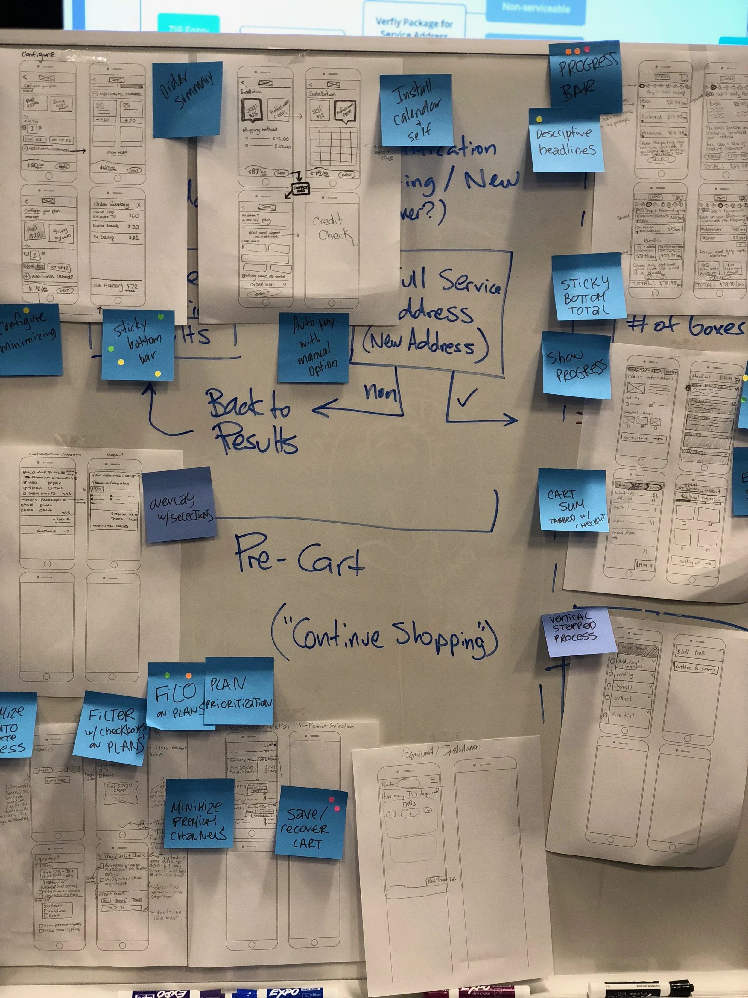
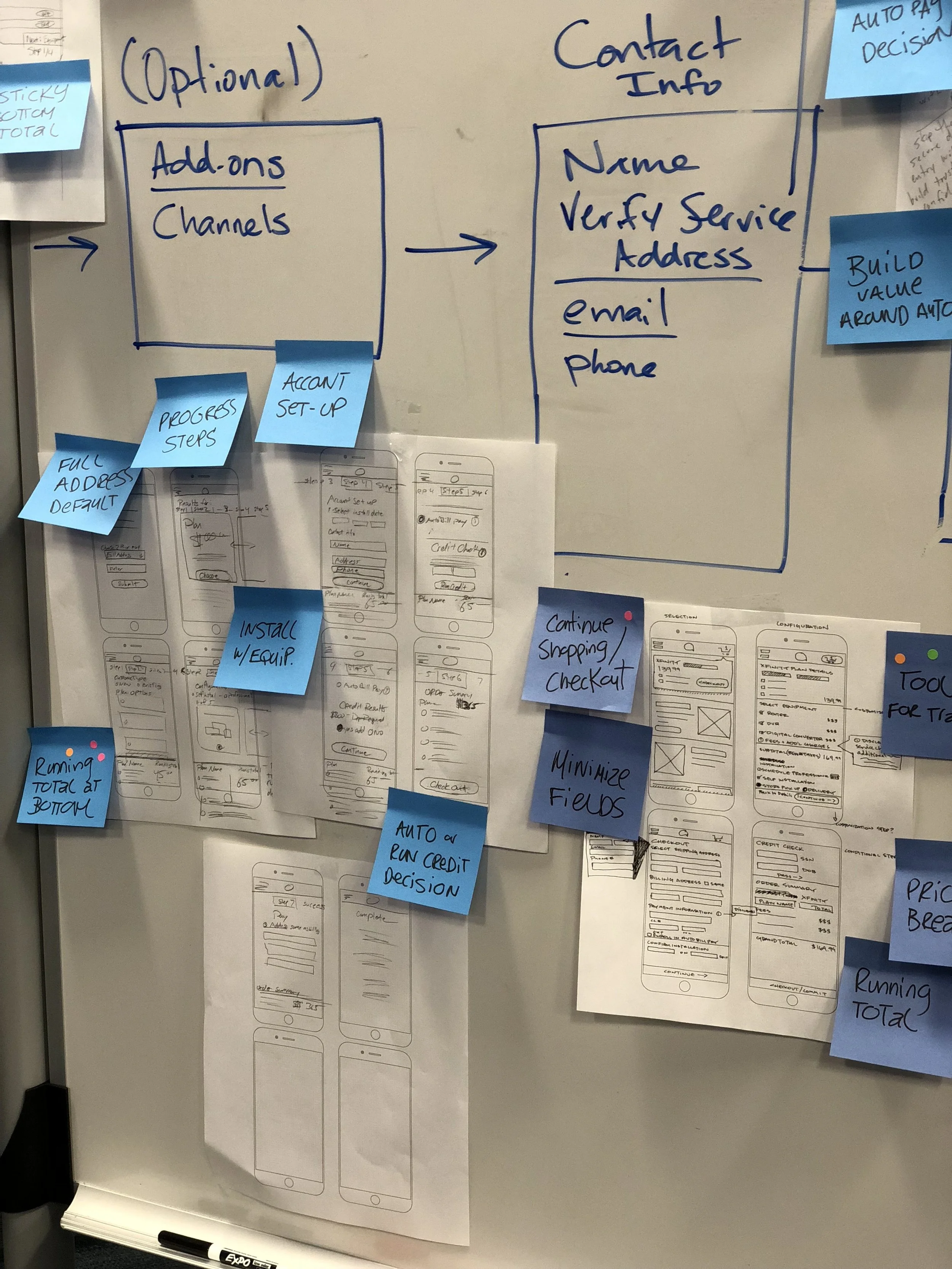
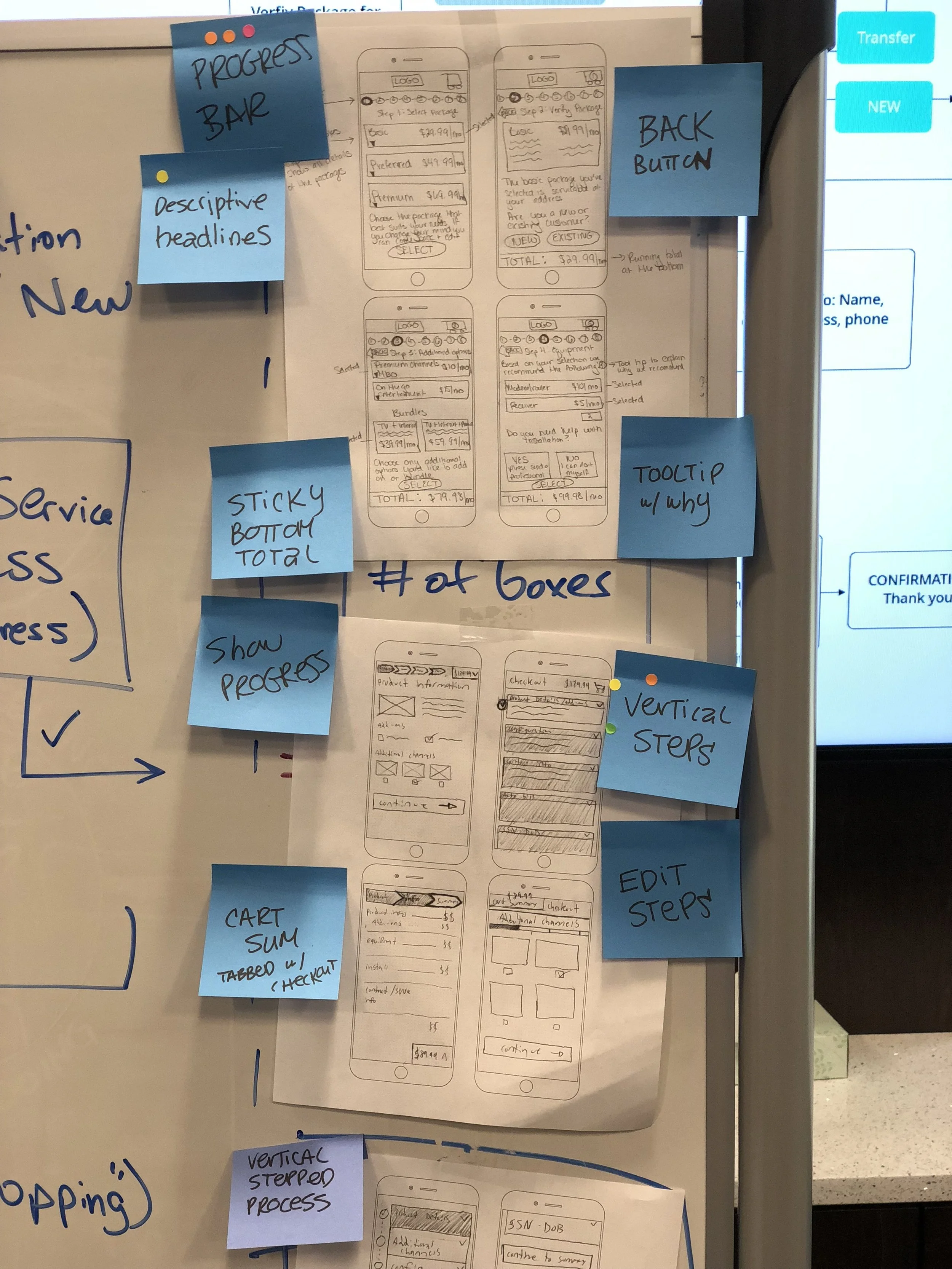
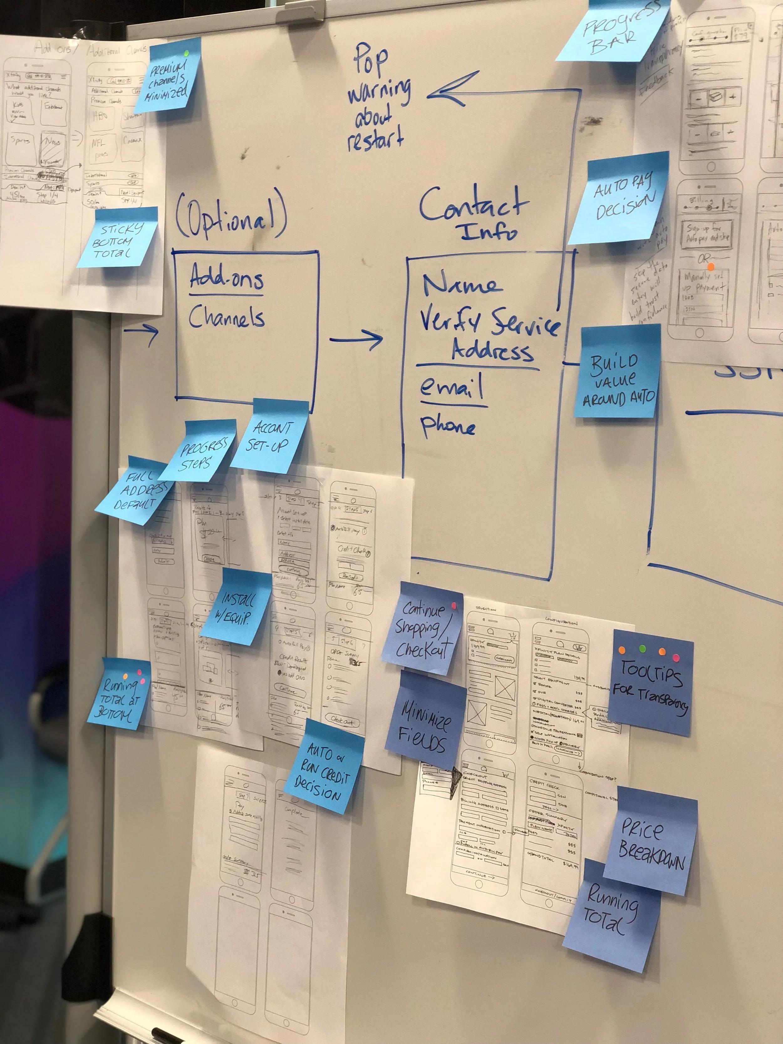
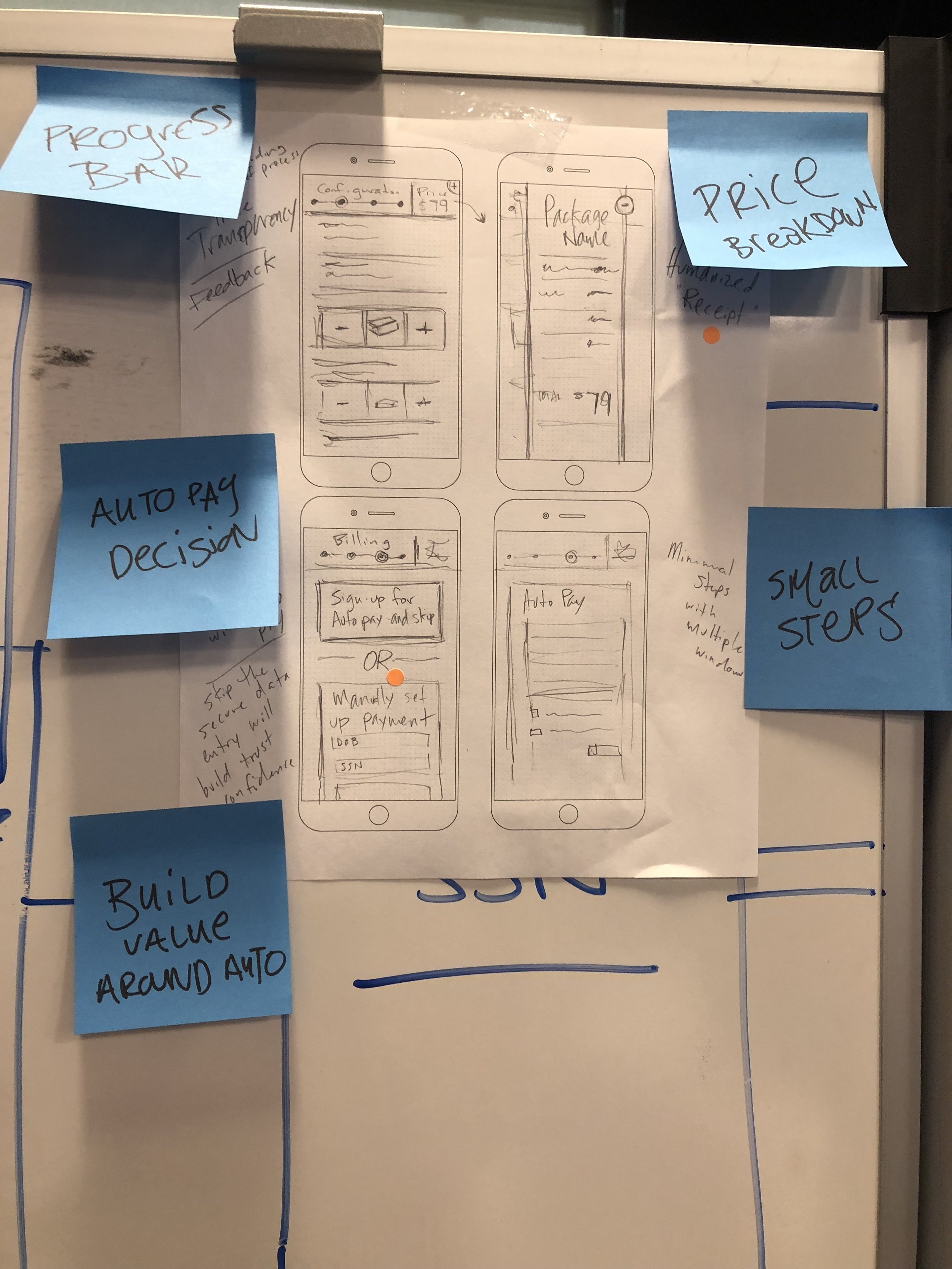
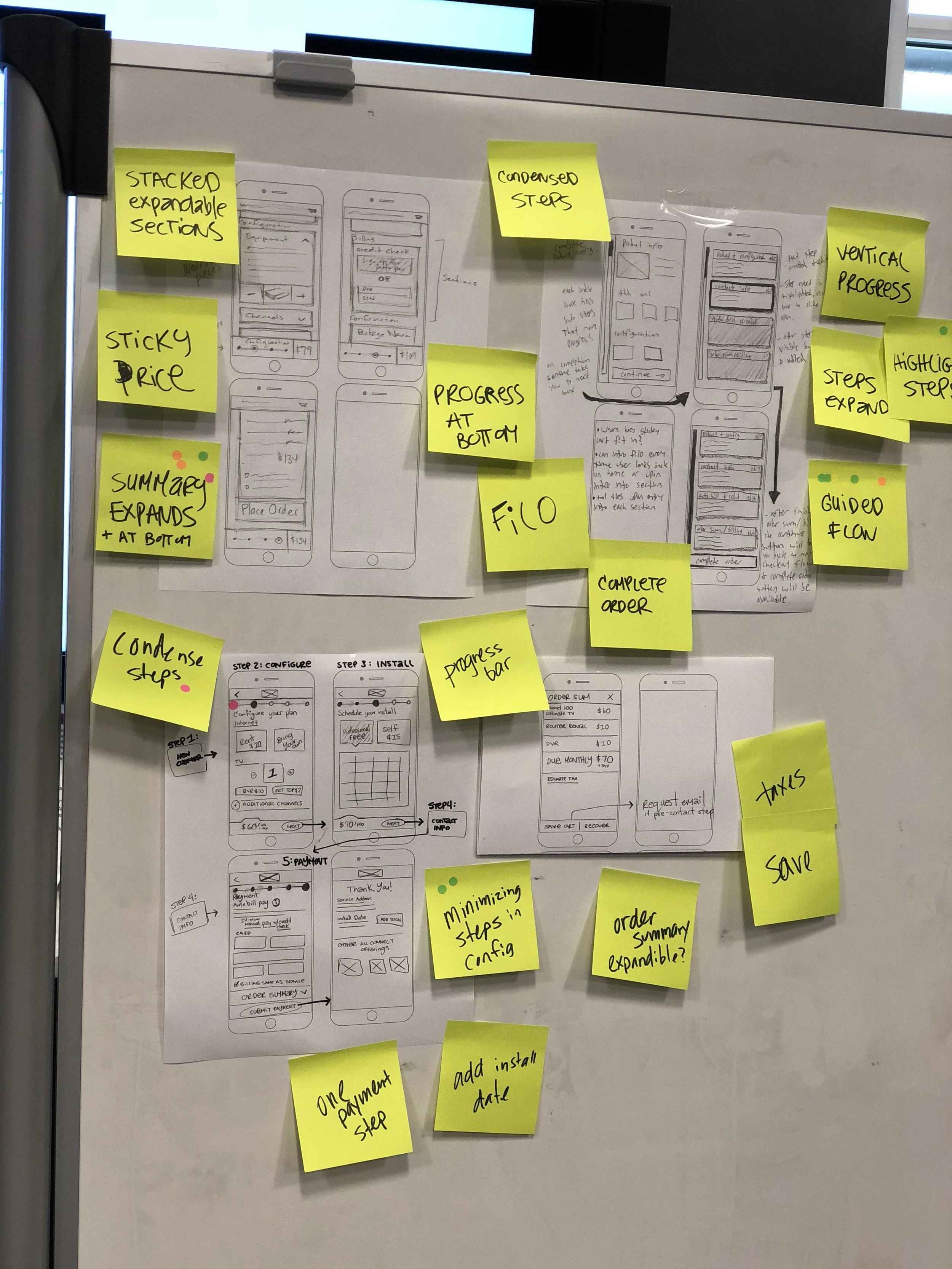
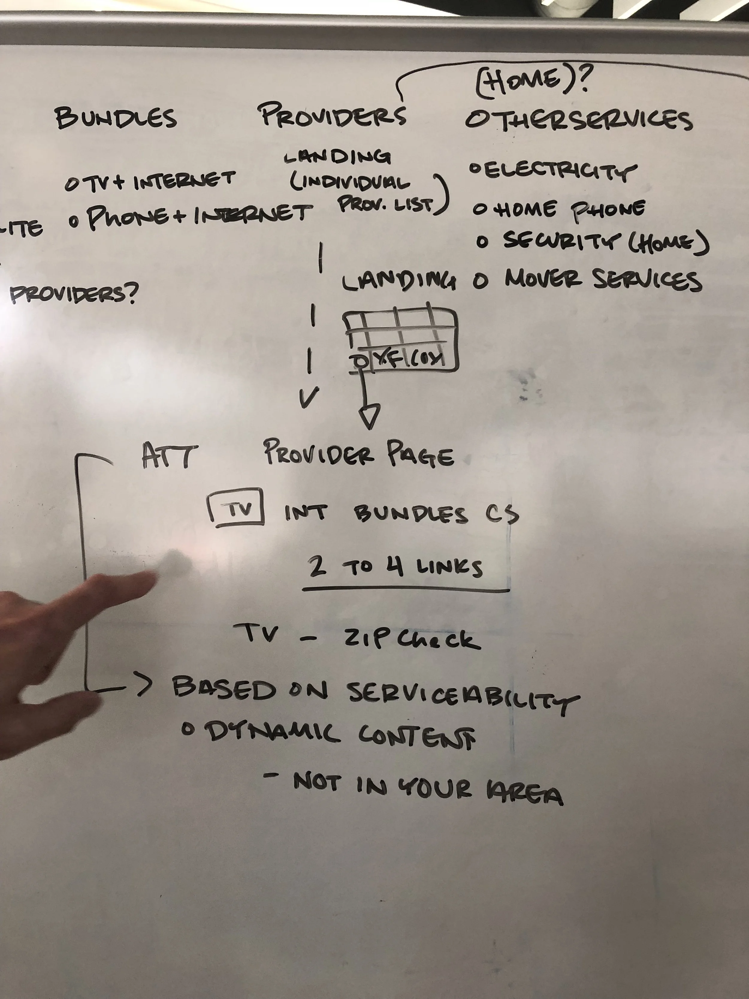
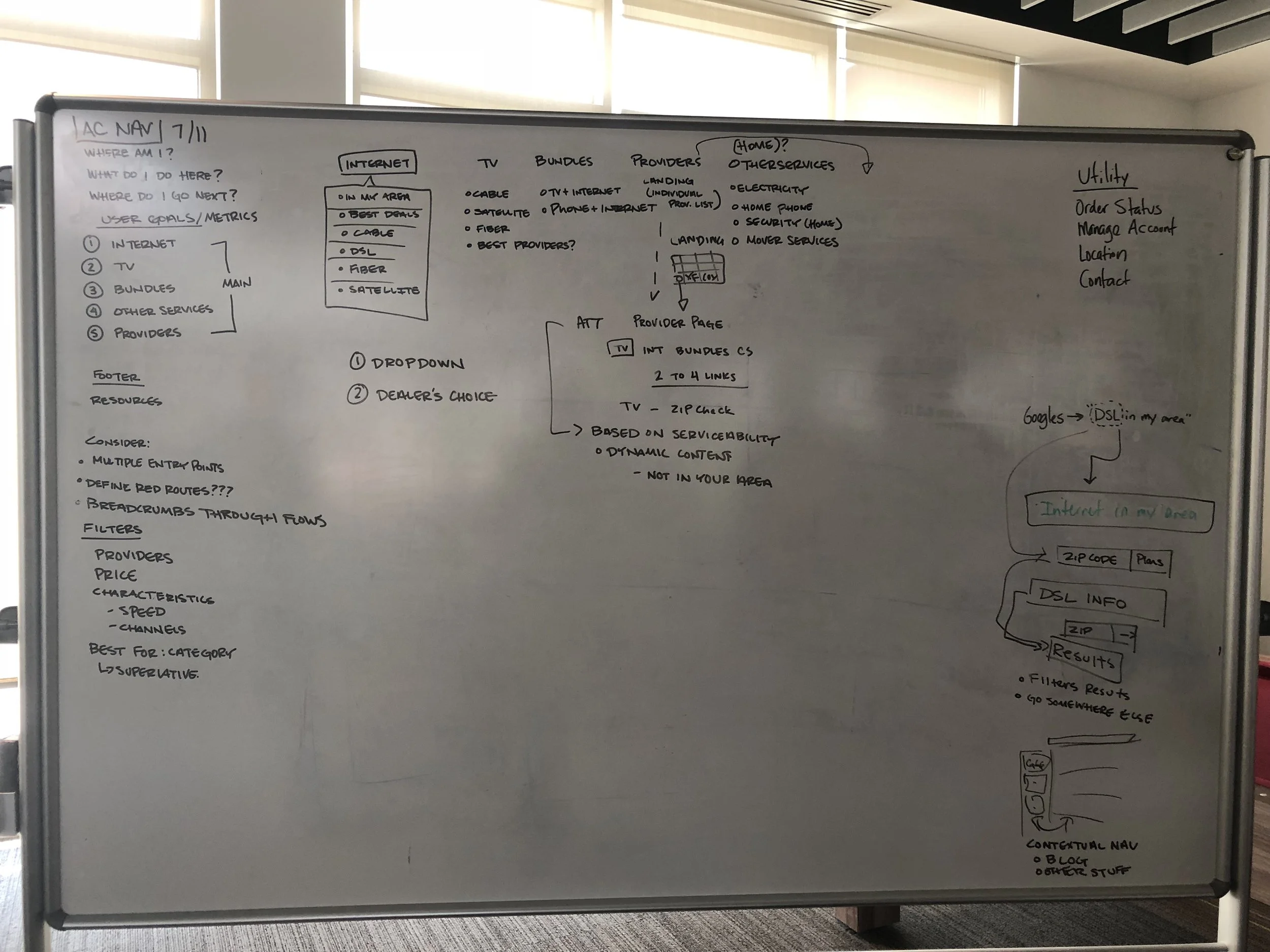
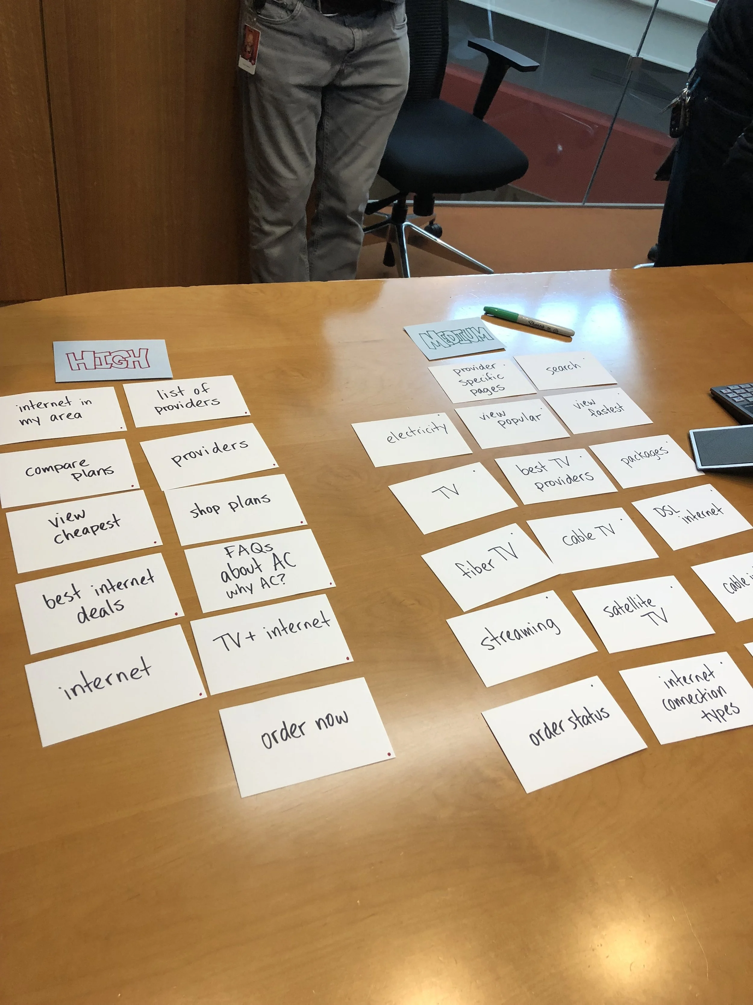
We wanted to create a set of design principles that would scale the entire product and really build a cohesive system in which users interacted familiarly with each part of the site. We accomplished this goal by breaking off the most important parts of the site and focusing in on the strategy of each main feature. I've provided individual white boarding and sketches for a sample set of those features here.
Checkout Flow & Cart
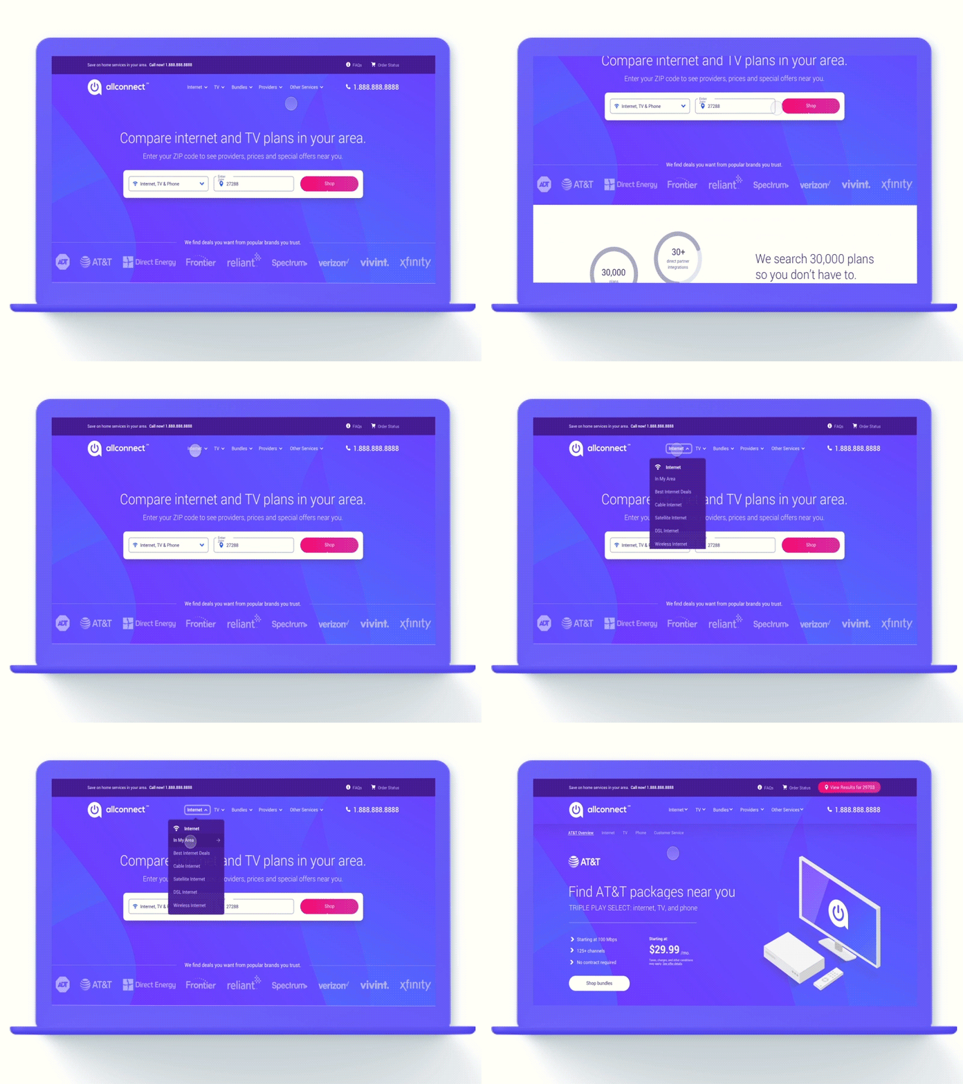
Navigation
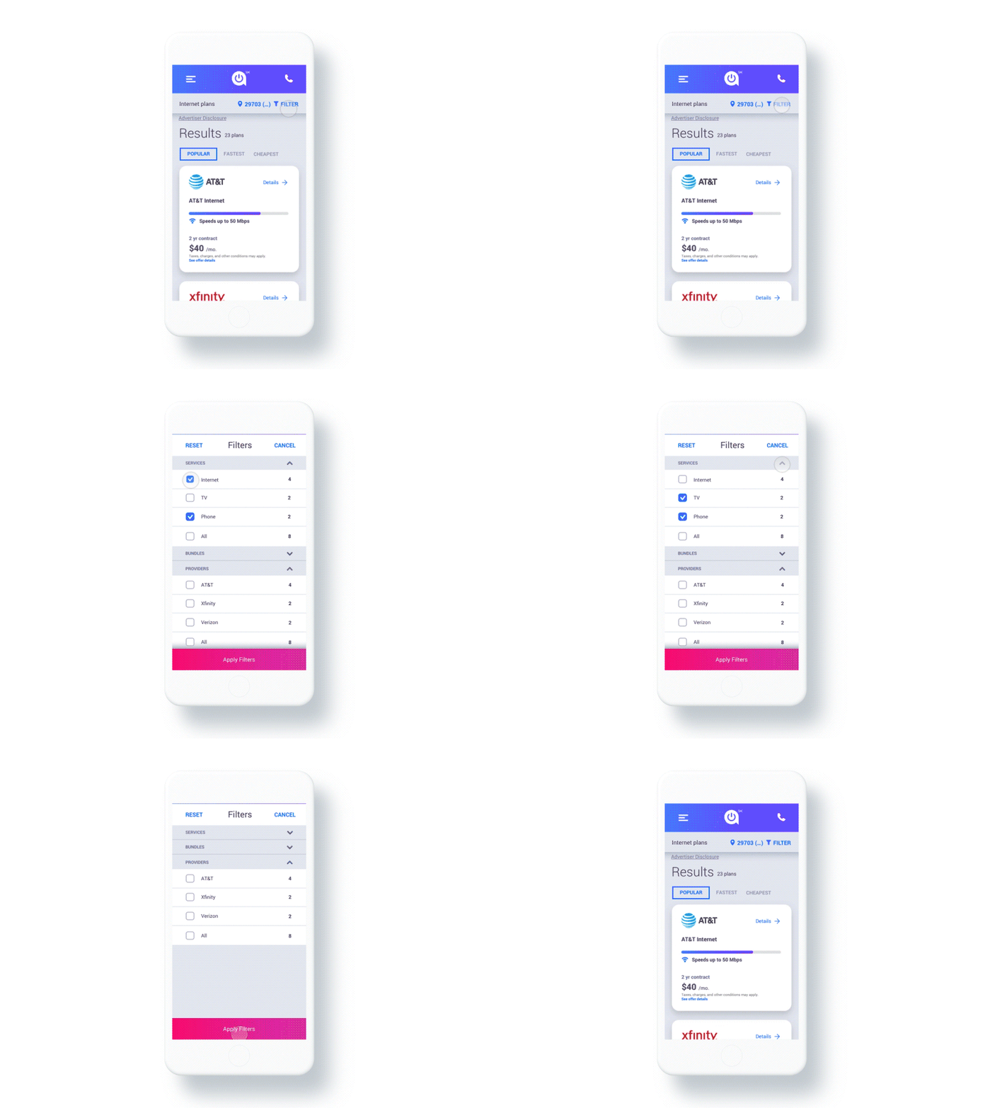
Filtering
WIREFRAMING
UI and UX combined to think through what our wires would look like. Main flows were created by our dedicated UX resource and all conditional states, modals, etc were created by the design team.
SCALABLE DESIGN SYSTEM
We knew that Allconnect was just in it's beginning stages and had planned a lot of new feature updates for the future. A lot of time up front was spent on developing a style guide and symbol library so all future projects would be easier as team members transitioned on and off of the project. This way, no matter who touched the site, it would have the same look and feel.
UI DESIGN
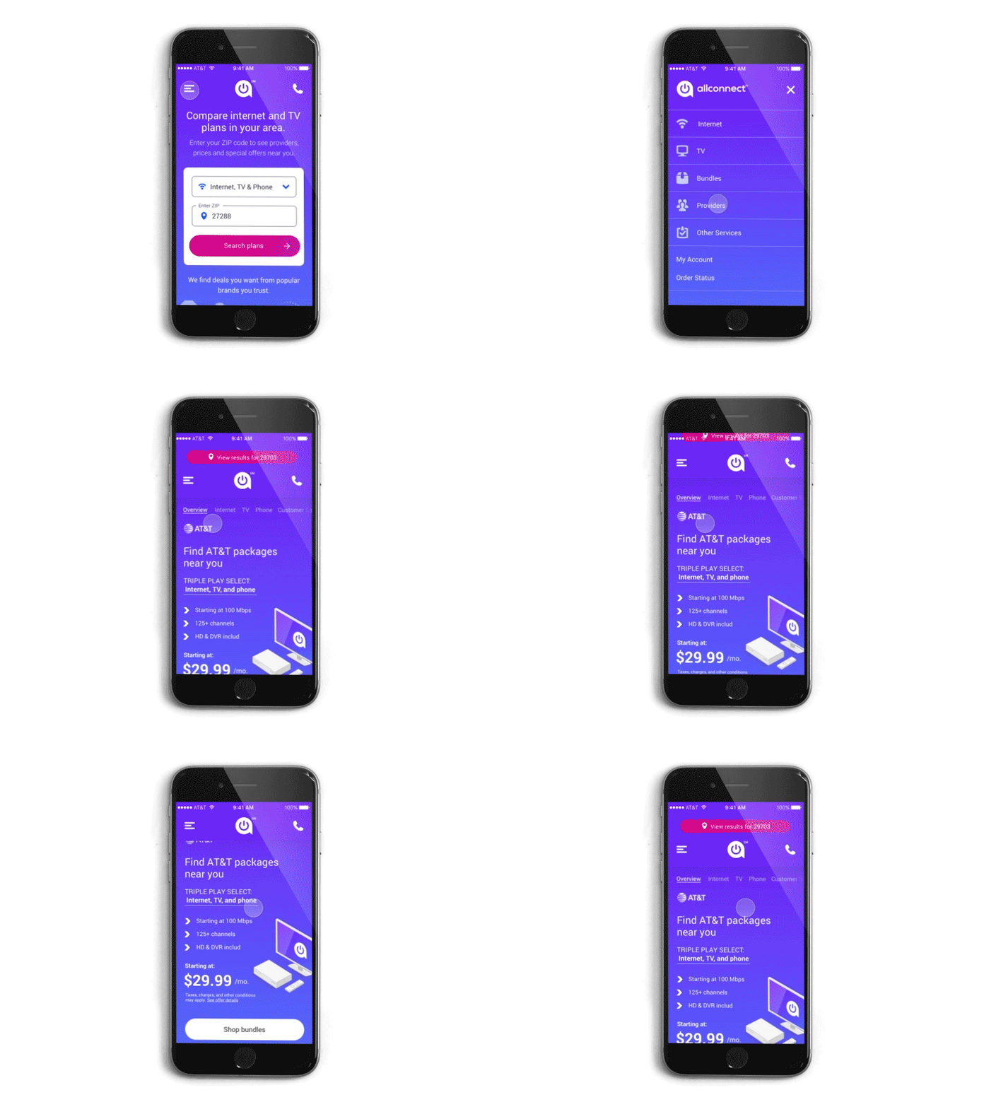
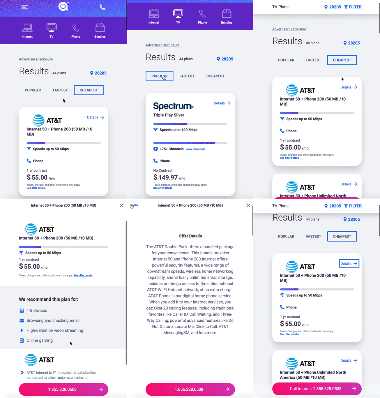
We decided to go with more of a modern day "app" feel because the future plans of Allconnect lean on more of the product side of design. We felt this would make the transition from web-to-app flow more natural.
INTERACTIONS & ANIMATION
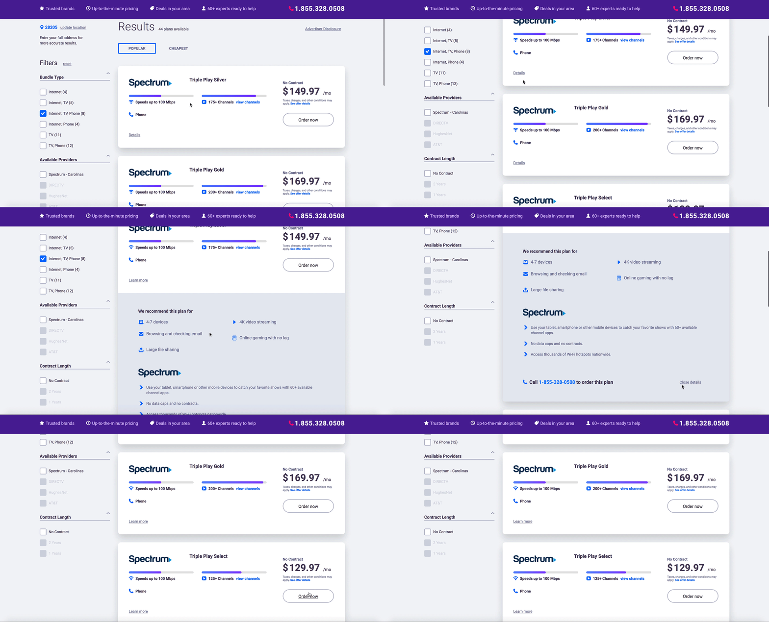
Part of the overall design language includes micro-interactions and using animation to communicate clearly to our dev team how we wanted the site to operate. We really focused on how our interactions could guide a user through various flows and offer more than just a cool visual design. I created animation primers including design specs in Principle and After Effects.
EMAIL RE-DESIGN
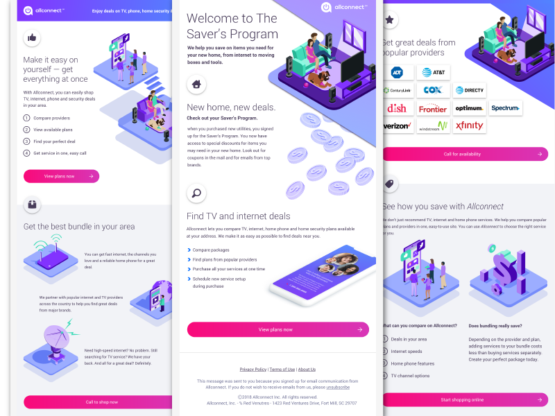
Since we changed the branding completely on the site, we had to also create new email assets. I worked with the content team to push out a variety of different marketing emails with new imagery and style that we wanted to add to the site after the initial launch.
RESULTS
We collect data everyday on how the site is performing but these are the results we recorded a month after the inital launch.


